Why is Data Visualisation Important in Business Intelligence?
Data-driven environment, businesses create and gather huge quantities of data every day. This data might range from customer interactions and sales numbers to operational analytics and market trends. However, because this raw data is usually so large and arrives in so many different formats (both organised and unstructured). It can be extremely difficult to make sense of. Without data visualisation to provide a clear method for interpreting these massive data sets, important discoveries can be obscured beneath layers of complication and uncertainty.
This is where business intelligence’s (BI) crucial capability of data visualization comes into play. Interpretation is made easier by data visualization, which converts raw, complex data into visual formats like graphs, charts, and dashboards. These visual representations help break down intricate data sets, making them more accessible, intuitive, and easy to understand.
Instead of sifting through endless rows of numbers and text, decision-makers can quickly grasp key insights and trends, enabling them to make faster, more informed decisions. Ultimately, data visualization enhances the effectiveness of BI by translating complexity into clarity, allowing businesses to act on their data with confidence.

Here are the key points:-
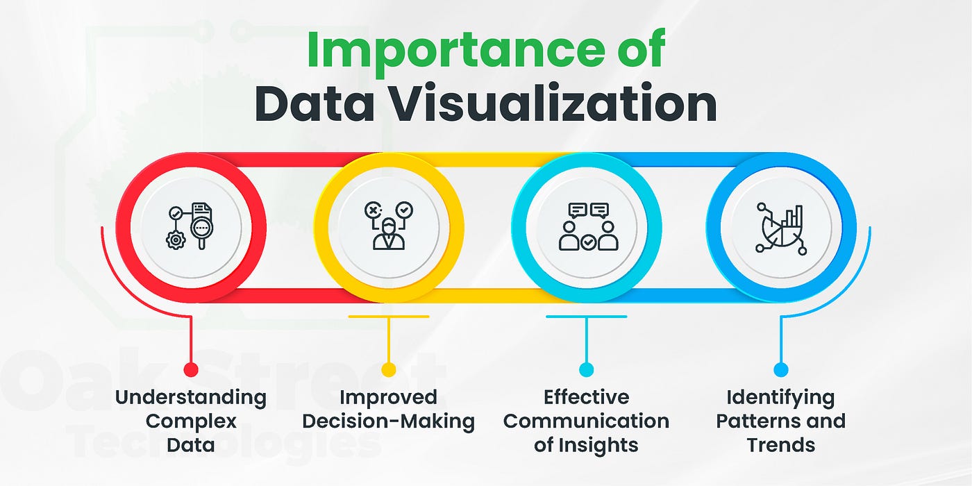
ImprovedData Interpretation
By converting enormous volumes of data into visual representations like graphs, charts, and heatmaps, data visualization makes it simple for business users to spot patterns, correlations, and trends. When data is visualized, it becomes easier to understand the story behind the numbers. A well-crafted visual chart can reveal key insights much faster than looking through rows of data in a spreadsheet.
Quick Decision-Making
In a competitive business environment, speed is often crucial. Visualization tools simplify the decision-making process by providing stakeholders with clear and concise information. Managers can quickly grasp the current business state and act on insights immediately, rather than spending hours interpreting data. Businesses can maintain an advantage in cutthroat markets by using this quick analysis.
Identifying Trends and Patterns
Understanding historical data is vital for forecasting future performance. Data visualization tools help companies detect trends and recurring patterns that might otherwise be missed. For instance, sales teams can easily track which products are performing well in specific regions or during particular seasons. Identifying these trends early on can lead to strategic adjustments that drive business growth.
Better Communication
Complex data is difficult to communicate without visuals. Data visualization allows businesses to present data insights to stakeholders in a way that is clear, engaging, and persuasive. Visual aids like pie charts and dashboards can enhance the persuasiveness and accessibility of data-driven insights in presentations. While they are given to clients or at internal team meetings.
Increased Engagement
Visual content captures attention more effectively than plain text or numbers. Data visualization not only makes information easier to process but also more engaging. This increased engagement ensures that stakeholders are more likely to focus on key insights, leading to better collaboration and understanding across departments.
Improved Data Accuracy
Data visualization tools often allow for real-time data analysis. This means that businesses can get instant insights as new information becomes available. Forecast accuracy can be increased through real-time data monitoring. Which also helps firms remain flexible and modify their plans in response to the most recent facts.
Supports Predictive Analytics
While predictive analytics is essential for businesses and business intelligence aiming to anticipate future trends, customer behavior, and potential challenges. Visual data representations help analysts project potential future outcomes by identifying patterns and irregularities. By visualizing this predictive data, businesses can make proactive decisions, reducing risk and optimizing performance.
Detecting Outliers and Anomalies
When data is visualized, outliers or anomalies that could indicate significant business risks become more visible. Businesses can use visualization tools to detect unusual patterns in customer behavior, sales, or even operational processes. These insights allow companies to take corrective actions before minor issues escalate into bigger problems.

Encouraging Data-Driven Culture
An organization’s data-driven culture is fostered by data visualization. When decision-makers see how effectively data can be interpreted through visuals, they become more reliant on data-backed insights. So this change results in decisions that are better informed and supported by factual information as opposed to gut feeling or speculation.
Conclusion:
Data visualisation is a vital component of BI because it enhances understanding, speeds up decision-making, and improves communication. So businesses may maintain their agility, maximise performance, and make more strategic decisions by transforming complex data into understandable visual insights. In today’s data-centric world, leveraging visualisation tools is no longer optional; it’s a key differentiator for success.


Post Comment